Problem Statement
Degree Planning Headaches
Stanford students struggle to track degree progress due to fragmented, outdated resources. The process is highly manual, requiring students to piece together information from multiple websites, often leading to missed requirements and ineffective academic planning.
Solution
A Degree Tracker that Minimizes Information
Hunting and Manual Tracking
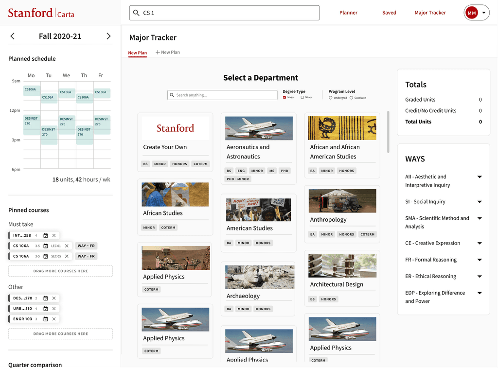
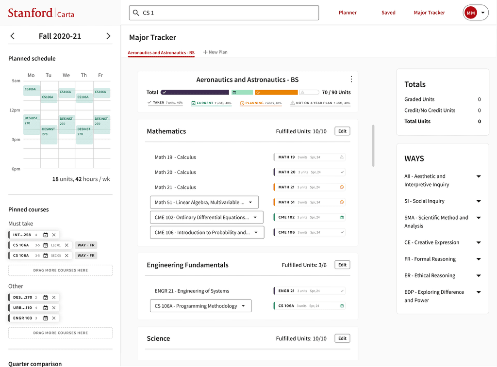
The solution is a centralized degree-planning tool that integrates directly with Carta. Students can select one or multiple majors, and all associated requirements are automatically uploaded. A progress bar visually tracks progress for each major, helping students easily plan and monitor their academic journey.
Result
Implementation Ready
Collaborated with engineers to ensure high-quality documentation of design.
Process
Context
The Future of Educational Roadmaps
95% of undergraduate students use Carta regularly
Carta is a Stanford affiliated course planning platform preparing to launch a new version with expanded features.
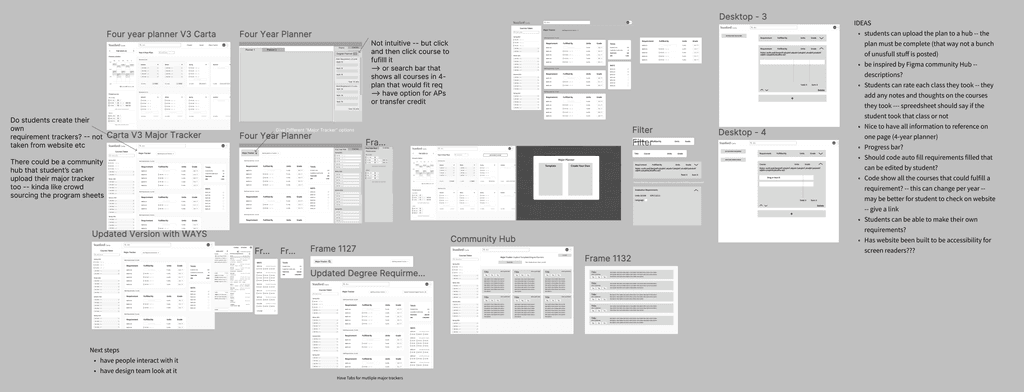
Discovery
Interviewed Stanford students to understand the tools and processes used in degree planning.
"Why am I having to transfer information that's already on the website to another document, then to another document? So yeah, it's a little tedious."
Main Insights
Too Many Tabs and Copy-Pasting
Students were frustrated with the need to constantly switch between tabs and manually copy-paste information into their own documents.
Visually Intuitive Four-Year Planner
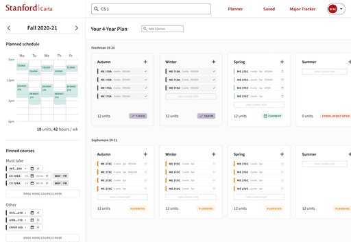
Many students use color-coded systems to organize their four-year plans. They desire better integration between their four-year planner and degree planner to easily see how their courses align with degree requirements.
"What If" Experimentations with Majors
Students appreciated being able to experiment with different majors while planning their courses but found existing tools lacked ability to explore and compare academic paths.
Competitive Analysis
Explored Educational Resources at Stanford and Beyond
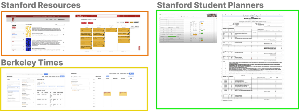
By reviewing current resources for students, it became clear that degree planning had a lot of pre-made structures. Developing a four-year planner was fairly manual, and quick methods to check how requirements were being fulfilled were attempted using some spreadsheets. However, there was a general lack of integration for easily viewing how a student's four-year plan fulfilled degree requirements.
How Might We
Re-framed Challenges
• How might we reduce the need for online scavenging to find degree requirements, minimize redundant tabs and copy-pasting, and simplify the overall process?
• How might we improve the four-year planner to provide more detailed information about degree progress?
• How might we make it easier for students to experiment with different majors?
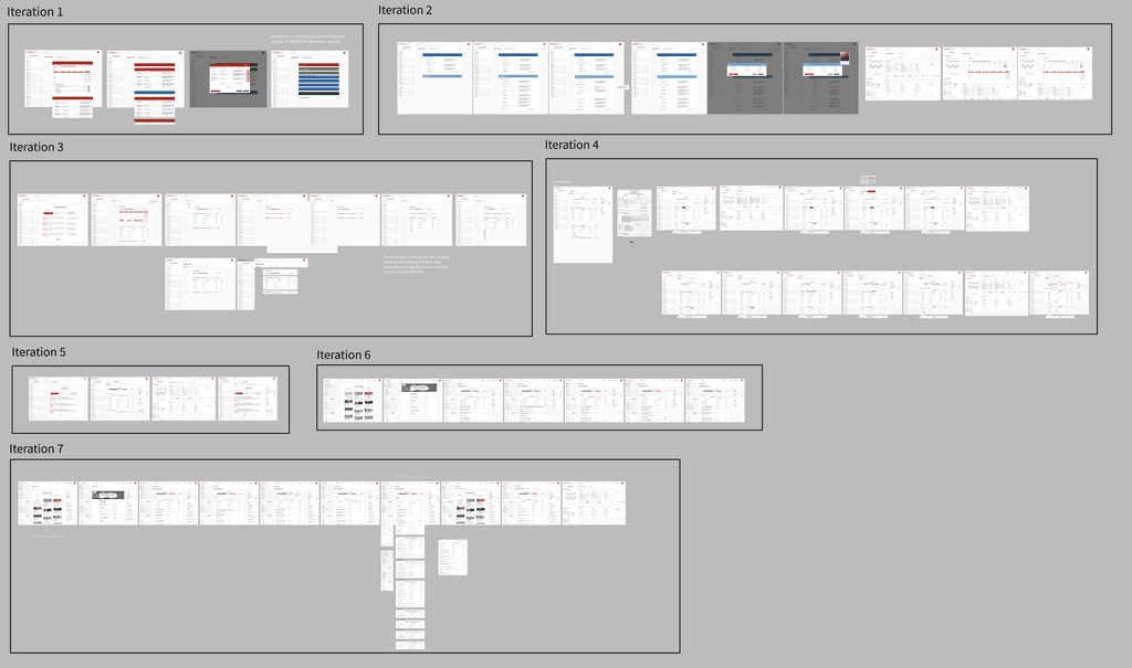
Iterating Designs
Refined New Capabilities
Allow students to select any major and automatically upload all its requirements to Carta.
Automatically update the four-year planner to show which requirements have been satisfied by existing courses.
Enable students to choose multiple majors and display a progress bar indicating completed versus required courses.
Low Fidelity
High Fidelity
Main Changes after User Testing
Select instead of Drag & Drop
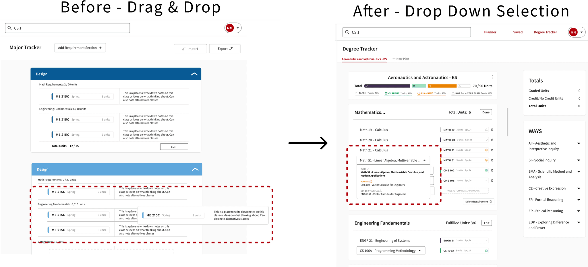
After consulting Stanford's Office of Accessibility, I learned that drag-and-drop interfaces are not ideal for keyboard users. Studies also show that people prefer selecting from predefined options rather than creating their own. User testing confirmed this insight, leading to a new UI where students select from a list of predefined classes for each requirement.
Keeping it Simple
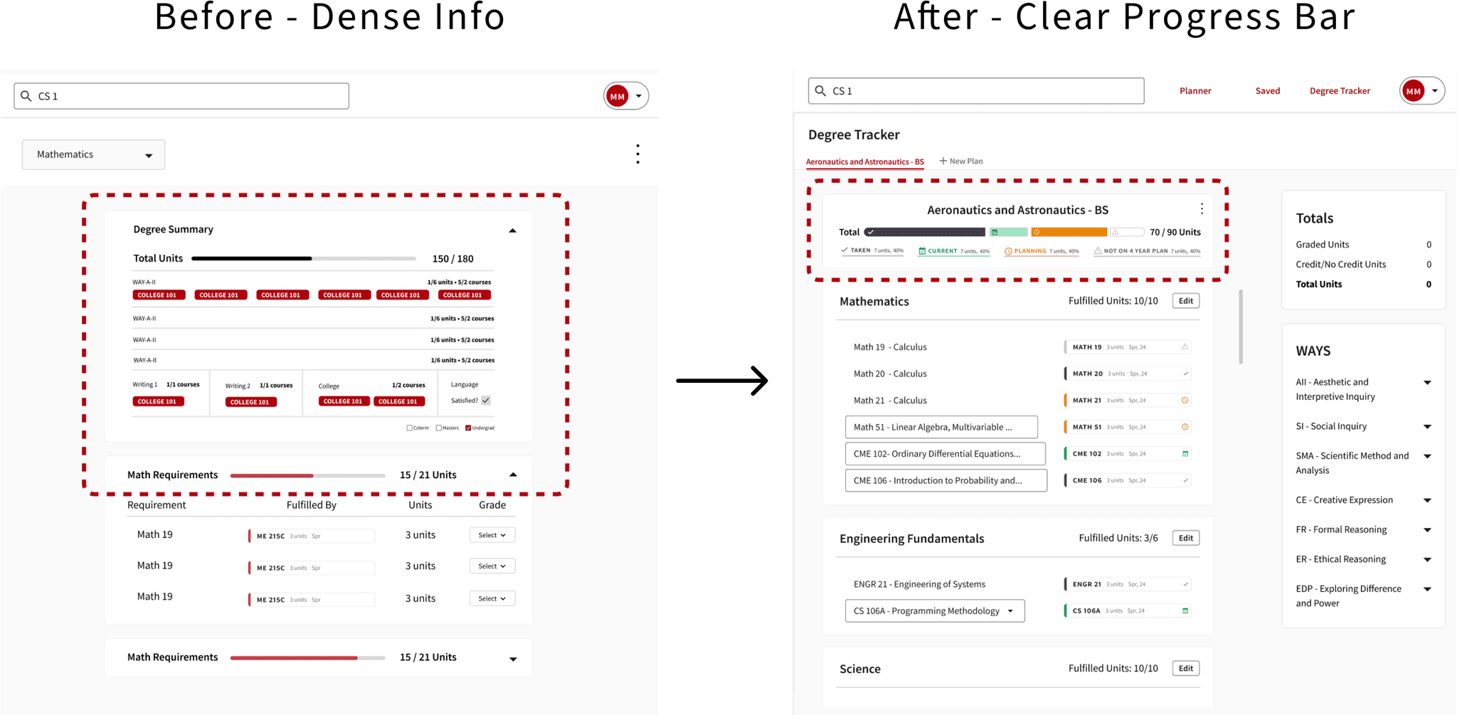
Research showed that tracking degree progress is helpful when it's actionable. Displaying completed, planned, and unplanned courses guides students better. The old design had too much irrelevant info, so I moved less critical details to the side, making the main content more central and prominent.
Quick Access
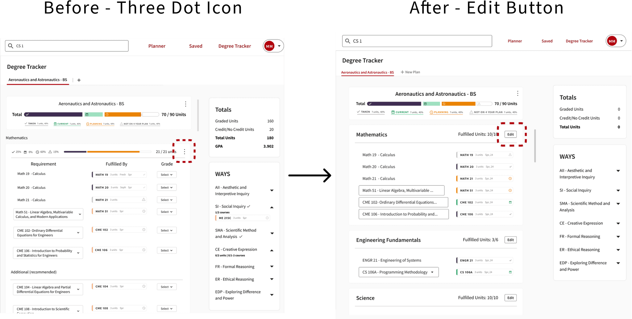
I initially used three dots for editing to keep the design clean, but it required extra clicks. Since students edit frequently, I made the edit option more visible. Testing showed a text "Edit" button was more intuitive than an icon. Though it reduced visual sleekness, the improved usability was worth the trade-off
Final Design
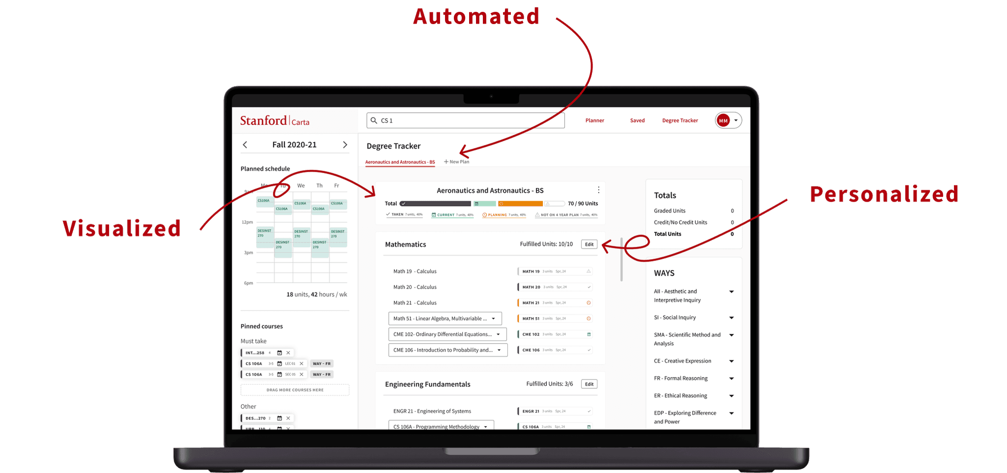
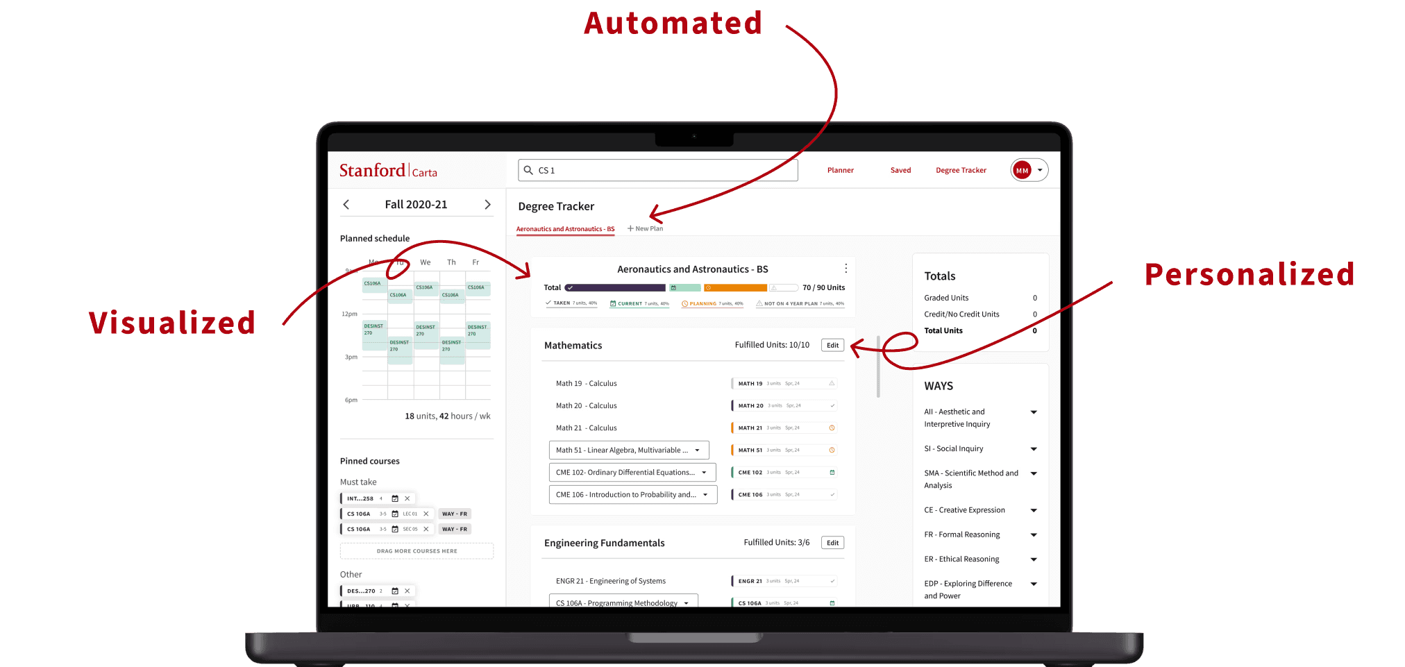
Automated
Choose degree to have requirements and current progress automatically filled out.
Personalized
Customize degree plan by editing requirements to fit needs. Track WAYS and unit count requirements.
Visualized
Easily identify degree progress and which classes in four year planner contribute to given degree.
Handoff
From Designers to Engineers
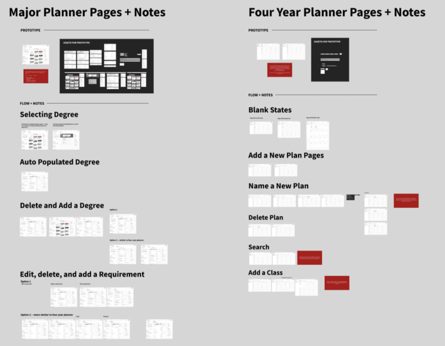
I document key design decisions and flows, making it easy for engineers to understand and implement the new UI, streamlining collaboration and execution.
Reflection
If I Had More Time
I kept the project separate from the four-year planner because another designer was focused on that aspect. In hindsight, combining everything into a single, cohesive space might have been more effective. With more time, I would explore designs that better integrate these two components to create a unified experience.
Additionally, I want to improve the site’s accessibility. While I ensured that symbols were used alongside color to convey meaning, I’m less confident that the interface is fully optimized for screen readers. One reason I moved away from drag-and-drop functionality is that it’s a difficult interaction to perform with keyboard navigation alone.